We are engaged by pictures long before we even learn to read.
Visualisations allow data to tell the compelling stories lying beneath.
My inspiration comes from the following
Big Data is like raw ore. You need to dig deep enough to find the treasure.
Visualisations unveil the absolute beauty of Mathematics
Maps highlight the precious details by presenting the broader picture.
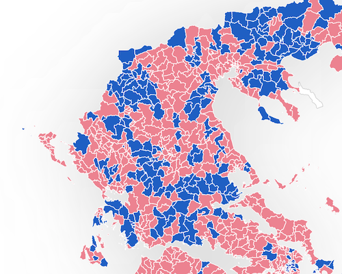
We are analysing the election results from different perspectives to get a better understanding of the voters behaviour
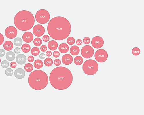
In the past 5 years, Greece has seen major shifts in electorate behaviour, thus heavily affecting the outcomes for the two major parties, SYRIZA and ND
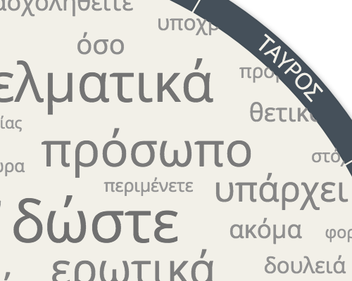
We analysed thousands of daily star sign predictions of a popular website in Greece to derive a word cloud reflecting the most commonly used words. We used our findings to build our own meta-prediction.
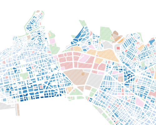
Thessaloniki, Greece's second largest city has seen its land value pressured by the financial crisis. But to what extent really? By collecting more that 10,000 real estate online prices, we are casting light on the real value in each city building block.
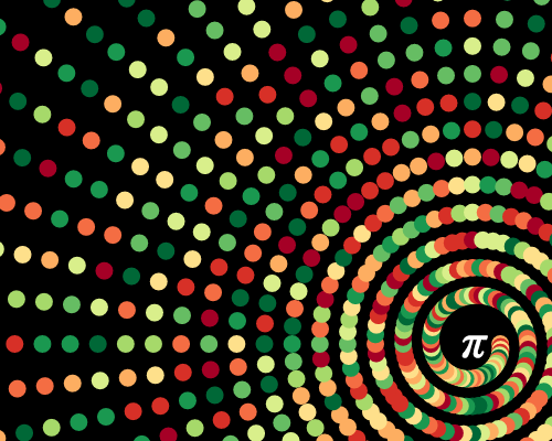
We are coloring each digit of these numbers as dots and connecting the lines between each consecutive digit. The result is animated with D3.js transitions to gradually unveil the intricate beauty of these irrational numbers.
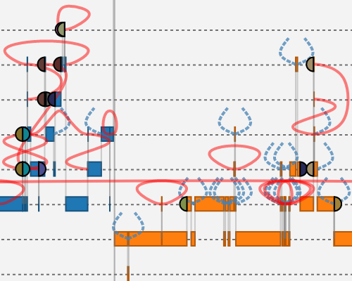
Prostate Cancer is affecting millions of men worldwide. In this diagram, we are proposing an alternative data visualisation in order to highlight the hidden correlations between the clinical measures.
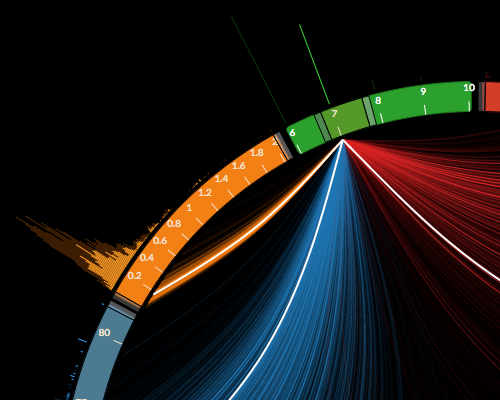
In this diagram, we are posting the data visualisation recently adopted by the NYGC in order to identify the rearrangements in the DNA leading to Cancer.
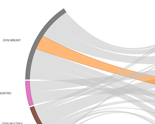
In this diagram, we are rendering the interrelations between tissues and stain orders in order to highlight cost distribution for lab managers.
I am a dedicated, enthusiastic and highly-motivated software professional with over 7 years commercial development experience. Formally educated in electrical engineering, computer science and software technology. I have a passion for rapid prototyping, specifically how vague concepts can be put to test.
I feel inspired about making things work in short iterations, building proof of concepts that can quickly validate a certain hypothesis. I am a genuine lover of Ruby on Rails, I adore this short of agile, straightforward way of prototype development.
I started with C/C++ and Java and slided into Ruby on Rails, HTML5, CSS3, D3.js and other Javascript frameworks. Infographeo is about how all these technologies blend in to manifest the beauty of data visualisations.